Unlike my personal website where I publish pages that are really in progress — with TODOs floating around, fragmentary thoughts, and much unpolish — any given in progress page on this ministry website is really only in progress insofar as I have not finished writing all the content that I expect to be eventually located on the page. That is to say, everything that is published on the page is already complete, edited, and checked-over for accuracy and correctness, but there is still more planned writing on the page to be completed.
I'm an outliner when I write, so how this plays out in practice is that I will fill in the outline skeleton (as displayed in the table of contents) with content over time, until the whole page is eventually complete.
Recommended Reading
General print vs screens
- http://www.newyorker.com/science/maria-konnikova/being-a-better-online-reader
- https://www.scientificamerican.com/article/reading-paper-screens/
- https://www.wired.com/2014/05/reading-on-screen-versus-paper/
- https://www.lezen.nl/sites/default/files/On%20reading%20in%20the%20digital%20age.pdf
- http://www.academia.edu/2244249/Mangen%5FA.%5F2008%5F.%5FHypertext%5Ffiction%5Freading%5Fhaptics%5Fand%5Fimmersion
- http://www.sciencedirect.com/science/article/pii/S0883035512001127
- http://scholarworks.sjsu.edu/cgi/viewcontent.cgi?article=1186&context=slissrj
- http://www.cdmc.ucla.edu/PG%5FMedia%5Fbiblio%5Ffiles/A250%20Subrahmanyam%20Michikyan%20et%20al%202014%20(paper%20vs%20screens)%5B1%5D.pdf
- http://www.tandfonline.com/doi/full/10.1080/00220973.2016.1143794?src=recsys
- https://news.ycombinator.com/item?id=8882481
Cognitive maps
- https://www.researchgate.net/publication/309562571%5FCognitive%5Fmap%5For%5Fmedium%5Fmateriality%5FReading%5Fon%5Fpaper%5Fand%5Fscreen
- http://www.sciencedirect.com/science/article/pii/S1071581905001722
My Hypotheses and Thoughts
Cognitive Maps
Cognitive maps are the determinative factor in organizing information efficiently (leading to better short term operational capacity and better long term memory encoding). When taking in information, we want to make it easiest to form cognitive maps. Some guidelines:
- Display two pages side by side like in print. Sweet spot between 1 column and more columns that don’t add helpful spatial understanding (and make relationships more confusing).
- TOC and hierarchical organizational structure. Always visible sidebar with shortened descriptions (as necessary) — up to 3+ layers (allow selection of detail level), and toggleable full-description (full-screen) layout. See below for why sectionality is important in content organization.
Progress bar for both current subheading (be able to choose level) and total progress in work as whole. Subheading bar on top of whole text bar (bars located at bottom of reading area).
- Subheading progress not available in print — no haptic equivalent.
- Sometimes the haptic equivalent for total progress in print is not used: e.g., reading with book on chest, reading on side, holding book with one hand — situations in which weight of either collection of pages is not resting completely on hands. Better to be consistent in judging location ⇒ use always present visual cues rather than haptics or combination. (Think specialization of labor and consistency).
- Lack of sensory discernment between pages (since pages weigh so little) — disadvantages of coarse grain perception in constructing cognitive map vs. finer grain perception that properly constructed visual cues allow. (Can’t really tell different thicknesses of page stacks by sight either; longer progress bar and color changes — see below — are better visual cues only available on screens).
- Haptic clues can also be deceptive, e.g. indexes and glossaries. May encode positional cues just fine, but will be “inaccurate” percentage wise.
Colors to indicate progress — color both progress bars and highlight color of current location in TOC (both sidebar and expanded version). Go across visual spectrum: adjustable increments (e.g., change every 0.5% of the way through, 1%, 5%, etc.), or allow selection of colors according to shade/darkness/intensity etc. Make customizable according to user preferences.
Header to reading area with current work, subsection, page number in whole work, and page number in section. Use format like 7/1 to indicate that the top left corner of a page refers to the seventh page of one section but first page of the next.
Include figures/pictures etc. to offer anchor points in text for forming “landmark-esque” cues to tie back to other information in cognitive map. Same deal with bulleted lists or other memorable structures.
Fixed display as with print. Since spatial information is automatically encoded, can help when referencing back to recently read material by only checking relevant area rather than having to navigate according to full semantic structure of every page.
- Does not necessarily need to sync up with page numbers (in eBooks), just needs to be consistent (so that when navigating with the menu structure it won’t put you at the top when you would be in the middle if you had read through, e.g. = different starting points should not yield different text layouts).
- Better to have footnotes be accessible only by link/click/hover etc. rather than disrupting cognitive map (another reason doesn’t need to match page numbers from print perfectly).
This study did not find differences in statistics when they switched physical layouts on the subjects.
- Perhaps subjects were not reading as closely as they would in studying = they remembered less spatial locations of text. No re-reading/review would theoretically also lead to less recall of physical locations of information.
- Perhaps subjects were not accustomed to using physical locations to find information by scanning only relevant locations. Such behavior may be learned and applied consistently only by those who pay attention to it.
- Perhaps a real difference existed but was only slight, and hence not statistically significant in this case. Small differences, on the order of seconds, may not seem like much, but will still add up over time.
- Discrete articles that each have a defined beginning, middle, and end may provide a less useful environment for physical page cues than one longer chunk of information that is not subdivided. E.g., remembering that the target information was near the beginning of one of the articles (“top left column of the first page”) will result in quick acquisition of the data regardless if the exact physical location is slightly changed (because while there may only be one column now the information is still in a very similar spot relative to a fixed position clue — i.e., “beginning” — leading to insignificant changes in speed), whereas “near the beginning” is much less useful if you have a longer continuous passage. (This logic provides a good argument for splitting up texts into discrete sections within a hierarchy rather than just leaving it in one big lump).
- Essentially, sections in a longer piece would function as the articles from the study. As long as you remembered a piece of information’s location relative to the beginning/middle/end of a section, page cues would be relatively less important.
- Basically, due to the short length of the articles, all a subject had to do to transmute their physical page cue from double column to single column was roughly judge in the single column the same relative position in the text, which would be significantly less useful if texts were longer. (= No significant changes in speed here even if page cues are faster in other circumstances).
- Also, the shift from two columns to one column is entirely predictable. This differs from a scenario with eBooks where due to whatever pagination scheme the text remains in two columns (or just one column, depending) but shifts forward or backward some amount (rather than always being positioned down somewhat further due to reduction in total text space).
Study did not take into account the effects of “expected position” if flipping back and forth, which is another relevant factor when learning/studying. If you go five pages back to look at something but then you position has shifted when you return, that’s a problem. (= Want fixed text regardless of considerations from study).
No scrolling! Scrolling leads to higher cognitive load and worse comprehension.
But enable a scrolling mode to allow for superior scanning ability and avoiding page breaks in the middle of sections you need to read/re-read. (Scrolling is much better for scanning a large amount of content — which is why it is so common for web pages).
Landscape for things that ordinarily have one column of text on two pages (like paperbacks and other books) and portrait for things where you have two/three columns on one letter-sized page (like many journal articles).
Cognitive Maps and Short Term Memory Effects
- I hypothesize that there exists a “moving window” of near perfect cognitive map recall. In this state of recall, one should be able to know immediately if something is within window or not.
- For short enough sources, the entire source may be in the window of near perfect cognitive map recall. For longer sources, it may just be most recently read part.
- The near perfect cognitive map in the recently read window is in short term memory – it will fade quickly with time. Forcing attention away (e.g., engaging in a different activity) will likely make the cognitive map decay faster. After this “short-term cognitive map” decays completely, differences in recall/information location will fade or at least be significantly reduced. ⇒ Discrimination between “recent” (i.e., in window = very complete cognitive map) and “not recent” (i.e., not in window = less complete cognitive map) is temporary and not encoded in memory for longer term information retention.
- This concept likely works on a spectrum, with a less clear cut window (i.e., it is likely a continuum towards less good cognitive maps rather than a one-and-done cutoff point). General idea:
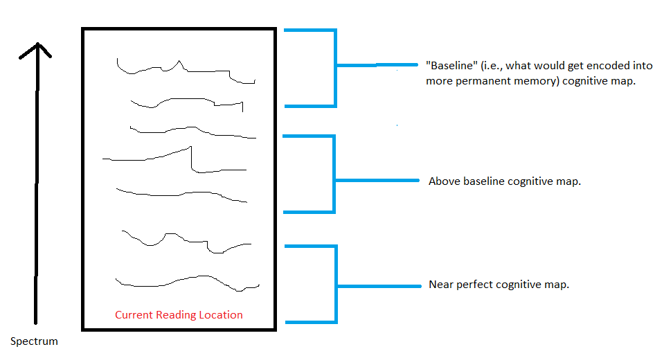
Figure 1: A rough outline of how cognitive maps work
- The magnitude of the enhanced cognitive map due to recent reading effect, the range of reading that effect applies too, how long it takes to decay under normal conditons, and how long it takes to decay with changes in attention probably all vary on continuums according to individual and circumstantial factors.
- Recap: Ability to judge information location as “recent” or “not recent” stems from enhanced cognitive maps that are an artifact of recent reading and will fade over time. After a certain cutoff point (going back in text(s) read), there will be no discernable difference in ability to locate information over “baseline” levels. After sufficient time has past/someone has focused on something else to the detriment of temporary cognitive maps long enough (or some combination thereof), all text will be at the baseline level.
- All this explains how in the aforementioned study where there was a series of “nearly linear” pages (approximating sections read in order in a chapter, e.g.), there was not a strong correlation between how close first guesses were to actual location and the number of pages opened. (Expected behavior: that guesses in same general area of linear progression even if not in right article first time would lead to less overall pages needing to be opened — because subjects remembered content proximity and relative time distance, i.e., whether the target was “near the beginning of the progression” or “near the end of the progression”).
- “When participants were wrong in their first guess about the location of a target fact [/i.e., they were outside of their near perfect recall window/], the efficiency of their search (in terms of the number of pages that they looked in) was no better than might be expected by chance, and not helped by prior reading of the document. These findings suggest that recall of location is ‘all or nothing’ [/which is to be expected at “baseline” levels without enhanced temporary cognitive maps/]. This suggestion is supported by the correlational analysis in Experiment 2 which found no relation between the size of the error in the page first opened and the length of the subsequent search in terms of number-of-pages visited.”
- “This evidence for structure maps in terms of documents first searched in does not extend to the number of pages opened during search. When participants do not know where first to look, their performance appears to be at chance, with some extremely long searches.”
- “The writing and scale-checking activities served to separate the read and search phase, by about 15 min. Once these were completed the search phase began.”
- All this explains how in the aforementioned study where there was a series of “nearly linear” pages (approximating sections read in order in a chapter, e.g.), there was not a strong correlation between how close first guesses were to actual location and the number of pages opened. (Expected behavior: that guesses in same general area of linear progression even if not in right article first time would lead to less overall pages needing to be opened — because subjects remembered content proximity and relative time distance, i.e., whether the target was “near the beginning of the progression” or “near the end of the progression”).
Cognitive Maps and Long Term Memory Effects
- Decays in cognitive maps from long term memory are an entirely different phenomenon from the loss of the temporary enhanced cognitive maps just discussed (and must be treated as separate). Now we are talking about memory decay that explains how you are better able to remember what you read several hours ago vs. 3 days ago.
- These memory differences due to decay from memory in the long term are probably much smaller in magnitude than the decays experienced from enhanced cognitive maps dropping from short term memory.
- Differences depend on lurking variables (e.g., the strength of different neural networks with respect to things in the cognitive map can vary, meaning that some information is better remembered because of better interconnectivity with already assimilated knowledge).
Other Screen Reading Considerations
Ought to have intuitive highlighting, underlining, annotation (with ability to link to words, sentences, or paragraphs; ability to convert handwriting to text — for search etc. — but keep handwriting; ability to put links in notes; ability to customize how/when annotations show, hover bahvior, etc.), bookmarking (with instantaneous ability to set and remove multiple bookmarks, some means for bookmarks to be descriptive of the text they mark, and easy commands to go to specific bookmarks). Should be able to press and drag for highlighting and underlining, but also be able to use tap selection: 1 tap = word, 2 taps = sentence, 3 taps = paragraph. (Be able to adjust how fast taps must be in succession to register).
- Have a look at a project called Hypothes.is for some good starting ideas about digital annotation.
MUST be able to flip more than one page at a time — to emulate flipping through pages like a print book when skimming / looking for something. Holding down a button like flipping pages — customizable speed. Should also be able to flip “chunks”.
eBook “Extras” — built in (English) dictionary, links to wikipedia, links to other works in library and links to internet (but ability to disguise/turn off links if desired to minimize cognitive load / undesired hypertext), lexicons/foreign language dictionaries with parsing as appropriate, dictionaries/encyclopedias, full text searches, text searches on title/header content, fuzzy searches, regex-enabled fine grain searches, scrolling in-line notes (either personal — see annotation — or external like scholarly commentaries or textual apparatuses), features like Kindle x-ray for identifying characters and usage across a text, vocab builder tools.
Wearing blue blocking glasses reduces easily scattered blue light and increase contrast. Less blocking during the day for better/more true color on screens, and because our bodies expect higher blue levels during day. Full blocking a couple hours before bed to allow for melatonin production. Wear prescription blue blocking glasses or blue blocking glasses that you can put over regular glasses (like these) for long periods of computer use rather than contacts (which can lead to dry eyes). I like using the over-normal-glasses variety (even though they are really ugly) because they give me the option of blocking blue light with either contacts or prescription eyewear, depending upon circumstances.
I also highly recommend f.lux to make screen reading better.